Good all days ecommerce website design
Good all days ecommerce website design
What Deserved to Be Believed
What Deserved to Be Believed
user experience
user interface
art direction
web design
client
Good all days
my role
UX/UI Designer & Art Direction
Duration
12 weeks
year
2025
Overview
This case study covers my work on Good Old Days, a responsive e-commerce website for a European apparel brand selling unworn vintage clothing from the 90s and early 2000s. It walks through how I took a brand I had already built from scratch and translated it into a full end-to-end website experience, from concept to launch, designed to make rare, never-worn vintage pieces feel as trustworthy as they are special.
Overview
This case study covers my work on Good Old Days, a responsive e-commerce website for a European apparel brand selling unworn vintage clothing from the 90s and early 2000s. It walks through how I took a brand I had already built from scratch and translated it into a full end-to-end website experience, from concept to launch, designed to make rare, never-worn vintage pieces feel as trustworthy as they are special.
role
Already Home
This one came with a head start. I had already built the brand for Good Old Days, so when the website project came in, the discovery phase was already behind us. The research, the brand direction, the visual language, all of it was documented and done. I knew the people, I knew what they expected, and they knew what they were going to get. All that was left was to bring it to the screen.
Key Challenges
A Brand That Already Knew Itself
Challenge
Strong stakeholder opinions. The team had a clear vision, and without a shared framework, every design discussion risked becoming a debate about personal taste.
Keeping design grounded. With a strong brand already in place, the risk was leaning too hard into expression and losing sight of what actually drives conversion.
Design and development disconnect. A WordPress build with no established handoff process meant gaps between design intent and what actually got built.
Brand vs business. Looking distinctive and converting well pulled in different directions throughout the project.
Solution
Built a decision framework first. Before touching any screen, I established design principles tied to user needs and business goals. Every stakeholder conversation had an objective anchor, not a subjective one.
Used the brand as a tool, not a mood board. Instead of letting brand expression drive decisions, I evaluated every visual choice against the customer journey. The brand worked in service of usability, not against it.
Embedded myself in the build. I stayed close to developers throughout, documented interactions and responsive behavior early, and built reusable components so nothing got lost between design and code.
Validated early and often. Regular review sessions throughout the project meant direction was confirmed before it became expensive to change
Results
Faster decisions, fewer revisions: Stronger alignment from the start meant less back and forth and a cleaner path to delivery.
More realistic roadmap: Late-stage changes became less disruptive because priorities were clear and documented.
Better use of engineering time: By focusing on high-impact improvements first, development effort went where it mattered most.
Stronger collaboration: Design, product, and engineering stayed aligned throughout, reducing misunderstanding and building confidence on all sides.
Key Challenges
A Brand That Already Knew Itself
Challenge
Strong stakeholder opinions. The team had a clear vision, and without a shared framework, every design discussion risked becoming a debate about personal taste.
Keeping design grounded. With a strong brand already in place, the risk was leaning too hard into expression and losing sight of what actually drives conversion.
Design and development disconnect. A WordPress build with no established handoff process meant gaps between design intent and what actually got built.
Brand vs business. Looking distinctive and converting well pulled in different directions throughout the project.
Solution
Built a decision framework first. Before touching any screen, I established design principles tied to user needs and business goals. Every stakeholder conversation had an objective anchor, not a subjective one.
Used the brand as a tool, not a mood board. Instead of letting brand expression drive decisions, I evaluated every visual choice against the customer journey. The brand worked in service of usability, not against it.
Embedded myself in the build. I stayed close to developers throughout, documented interactions and responsive behavior early, and built reusable components so nothing got lost between design and code.
Validated early and often. Regular review sessions throughout the project meant direction was confirmed before it became expensive to change
Results
Faster decisions, fewer revisions: Stronger alignment from the start meant less back and forth and a cleaner path to delivery.
More realistic roadmap: Late-stage changes became less disruptive because priorities were clear and documented.
Better use of engineering time: By focusing on high-impact improvements first, development effort went where it mattered most.
Stronger collaboration: Design, product, and engineering stayed aligned throughout, reducing misunderstanding and building confidence on all sides.

UX DESIGN
Built Around the Hesitation
Here is the thing about vintage shopping online. You are asking someone to spend real money on something they cannot touch, cannot try on, and cannot inspect in person. That is a big ask. So before I drew anything, I needed to understand exactly where that doubt lives, what triggers it, what resolves it, and how to design around it.
Research
I ran whiteboard sessions, competitor deep dives, user interviews, and stakeholder reviews. What came back was consistent across all of it. The vintage customer is not impulse buying. They are deliberate, they do their research, and the moment something feels unclear, they are gone.
UX DESIGN
Built Around the Hesitation
Here is the thing about vintage shopping online. You are asking someone to spend real money on something they cannot touch, cannot try on, and cannot inspect in person. That is a big ask. So before I drew anything, I needed to understand exactly where that doubt lives, what triggers it, what resolves it, and how to design around it.
Research
I ran whiteboard sessions, competitor deep dives, user interviews, and stakeholder reviews. What came back was consistent across all of it. The vintage customer is not impulse buying. They are deliberate, they do their research, and the moment something feels unclear, they are gone.

Insight 01
Before anyone cares about the product, they need to feel safe. Every detail either builds confidence or kills it.
Insight 02
They are buying identity. Customers are building a wardrobe that says something about who they are.
Insight 03
Checkout is where trust gets tested hardest. If the answers are not already visible, the sale is lost.
Insight 04
They enjoy the hunt. The product had to let them discover at their own pace without feeling rushed.
Insight 01
Before anyone cares about the product, they need to feel safe. Every detail either builds confidence or kills it.
Insight 02
They are buying identity. Customers are building a wardrobe that says something about who they are.
Insight 03
Checkout is where trust gets tested hardest. If the answers are not already visible, the sale is lost.
Insight 04
They enjoy the hunt. The product had to let them discover at their own pace without feeling rushed.
Persona
One primary user. A creative professional between 25 and 35, a designer, photographer, architect, someone who buys less but chooses carefully. They know what they want, they research before they commit, and they will not complete a purchase if something feels off. For this person, clarity and trust are not nice to haves. They are the whole game.


key quote
"I want to know exactly what I am getting before I commit to it."
key quote
"I want to know exactly what I am getting before I commit to it."
the ui design
Familiar With a Twist
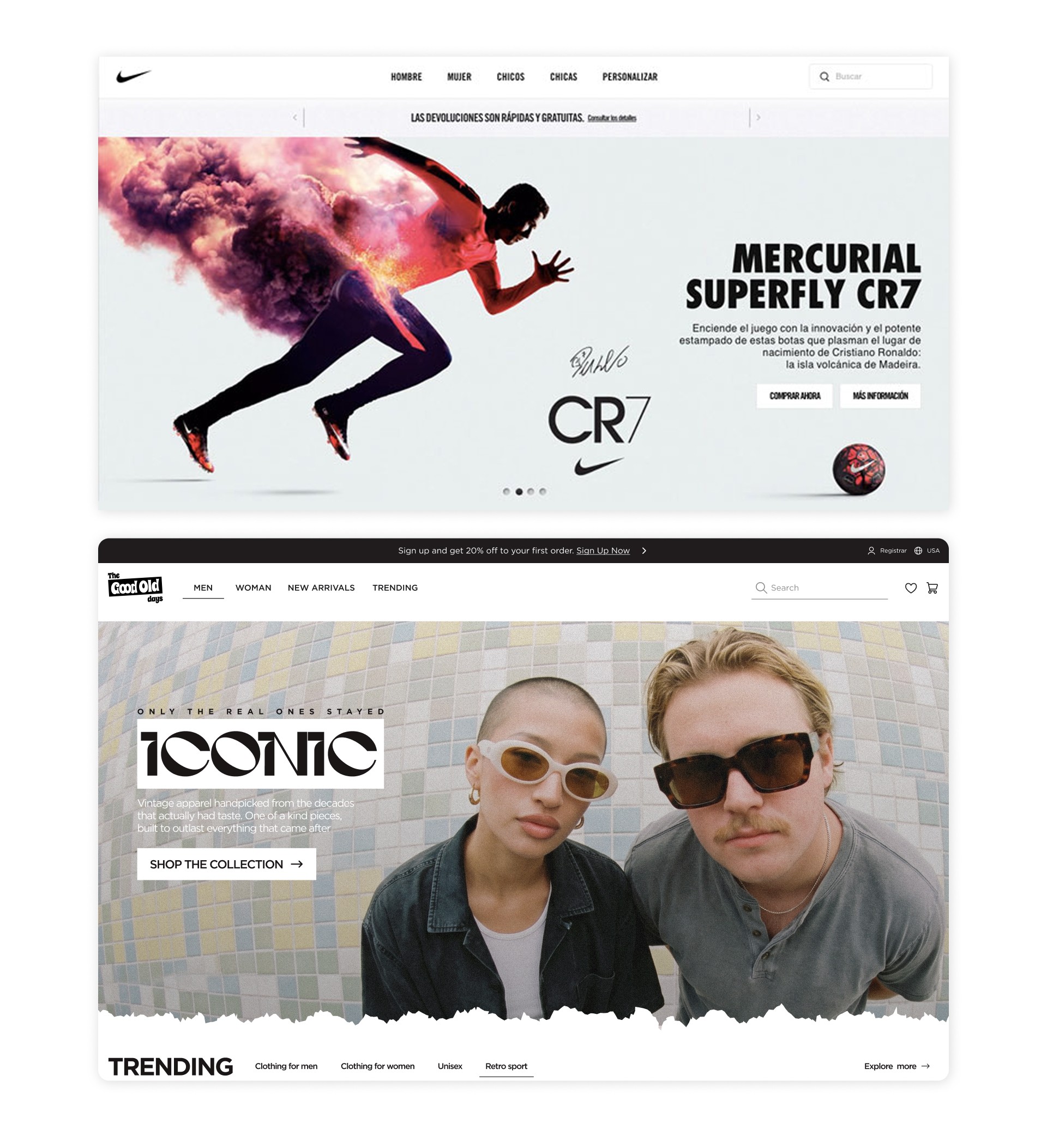
The brief was clear from the start: build something that feels like a great e-commerce website, then bring the brand into it. Not the other way around. Nike and Adidas were the reference points for structure and clarity. From there, we found the one place to make it our own.
the ui design
Familiar With a Twist
The brief was clear from the start: build something that feels like a great e-commerce website, then bring the brand into it. Not the other way around. Nike and Adidas were the reference points for structure and clarity. From there, we found the one place to make it our own.

Fonts- Gotham. Sharp, confident, and familiar enough to feel at home on a premium product page. It carries the brand's personality without drawing attention to itself.

Icons system- Google icons. Clean, recognizable, and exactly what users expect on an e-commerce site. No need to reinvent something that already works.

Colors- White as the base, with a pop of pink that runs through the brand like a signature. Clean and hipstery, young without trying too hard.

Layout grid- Twelve columns with a 16 pixel grid, built for a responsive web experience that holds across screen sizes.
Components
Familiar by structure, distinct in personality. The product pages, the navigation, the checkout flow, all of it follows the patterns users already know from every great e-commerce site they have used before. What makes Good Old Days different is the mood board experience embedded inside it. Think mini Pinterest, built around the clothes themselves. Summer looks, occasion dressing, curated collections that let users explore before they commit. It is the one place where the brand gets to speak in its own voice, popping off the page in a way you do not expect from a shopping site. The rest of the product earns trust. The mood boards earn the soul.
Components
Familiar by structure, distinct in personality. The product pages, the navigation, the checkout flow, all of it follows the patterns users already know from every great e-commerce site they have used before. What makes Good Old Days different is the mood board experience embedded inside it. Think mini Pinterest, built around the clothes themselves. Summer looks, occasion dressing, curated collections that let users explore before they commit. It is the one place where the brand gets to speak in its own voice, popping off the page in a way you do not expect from a shopping site. The rest of the product earns trust. The mood boards earn the soul.

The Purchasing Journey
Nothing Here Needed to Be Invented
By the time someone reaches checkout, they've already decided. This flow just had to get out of the way, using the exact patterns customers already trust from Nike, Amazon, and everywhere else they've bought something without thinking twice. Add to cart for browsers, buy now for the ones who already know, and an immediate, unambiguous confirmation either way. No reinvention, no friction, no reason to hesitate on a one of one piece. Familiarity here wasn't a compromise, it was the strategy. It's how sales went up, not engagement.
The Purchasing Journey
Nothing Here Needed to Be Invented
By the time someone reaches checkout, they've already decided. This flow just had to get out of the way, using the exact patterns customers already trust from Nike, Amazon, and everywhere else they've bought something without thinking twice. Add to cart for browsers, buy now for the ones who already know, and an immediate, unambiguous confirmation either way. No reinvention, no friction, no reason to hesitate on a one of one piece. Familiarity here wasn't a compromise, it was the strategy. It's how sales went up, not engagement.


the boards
A Small Way to Wander Before You Buy
The mood boards are a small, playful layer, not a second storefront. Scroll through a handful of curated boards, click into one, see the images that built it, then click into any image to find the exact products inside it. It gives the site a bit of texture for people who like to wander before they buy, without asking anything of the ones who just want to shop.
the boards
A Small Way to Wander Before You Buy
The mood boards are a small, playful layer, not a second storefront. Scroll through a handful of curated boards, click into one, see the images that built it, then click into any image to find the exact products inside it. It gives the site a bit of texture for people who like to wander before they buy, without asking anything of the ones who just want to shop.


Closing
The Work Behind the Work
Good Old Days was not just a website project. It was a lesson in what design actually is when you strip away the screens. The cleaner the process, the better the product. That was the real takeaway.
Winning Moments
A brand that translated perfectly. Taking a brand identity I had already built and bringing it to life on screen without losing any of its personality was the clearest win on this project.
Stakeholder trust, earned early. By creating transparency from the start, I kept everyone involved without slowing progress down. By the time we got to final reviews, there were no surprises and no battles.
A mood board experience nobody expected. Embedding a mini Pinterest inside an e-commerce site was the creative bet that paid off. It gave the brand a voice inside the product that no other vintage store had.
Lessons Learned
Clarity is where collaboration starts. People rarely disagree because they want different things. They disagree because they are working from different assumptions. Getting shared goals on the table early makes everything that follows smoother.
Alignment is not a meeting, it is a habit. It does not happen at kickoff and stay there. It has to be maintained throughout, through regular communication, continuous validation, and honest check-ins along the way.
Structure creates freedom. At the start of the project, a clear process felt like a constraint. By the end, it was the reason everyone could move fast and make decisions with confidence.
Closing
The Work Behind the Work
Good Old Days was not just a website project. It was a lesson in what design actually is when you strip away the screens. The cleaner the process, the better the product. That was the real takeaway.
Winning Moments
A brand that translated perfectly. Taking a brand identity I had already built and bringing it to life on screen without losing any of its personality was the clearest win on this project.
Stakeholder trust, earned early. By creating transparency from the start, I kept everyone involved without slowing progress down. By the time we got to final reviews, there were no surprises and no battles.
A mood board experience nobody expected. Embedding a mini Pinterest inside an e-commerce site was the creative bet that paid off. It gave the brand a voice inside the product that no other vintage store had.
Lessons Learned
Clarity is where collaboration starts. People rarely disagree because they want different things. They disagree because they are working from different assumptions. Getting shared goals on the table early makes everything that follows smoother.
Alignment is not a meeting, it is a habit. It does not happen at kickoff and stay there. It has to be maintained throughout, through regular communication, continuous validation, and honest check-ins along the way.
Structure creates freedom. At the start of the project, a clear process felt like a constraint. By the end, it was the reason everyone could move fast and make decisions with confidence.

@shahaf
contact@shahaf.com