Ascension App
Ascension App
The Shift I Didn't See Coming
The Shift I Didn't See Coming
user experience
user interface
design system
mobile
client
Ascension Trips and Travel
my role
UX/UI Designer
Duration
12 weeks
year
2025
Overview
This case study covers my work on Ascension, a full-scale travel app for iOS and Android that acts as a personal travel agent in your pocket. It walks through how I redesigned the travel experience from the ground up, from first search to final check-in, into one clear, connected journey that gives users someone to rely on every step of the way.
Overview
This case study covers my work on Ascension, a full-scale travel app for iOS and Android that acts as a personal travel agent in your pocket. It walks through how I redesigned the travel experience from the ground up, from first search to final check-in, into one clear, connected journey that gives users someone to rely on every step of the way.
role
Back to the Blueprint
This was a redesign project. An existing app under a boutique brand, ready to scale under a bigger company, needed a full rethink before it could get there. I came in as the solo designer, went back to the research, ran whiteboard sessions with the stakeholders, rebuilt the information architecture, and redesigned the experience from the ground up. Same product, new direction.

Key Challenges
A Redesign With No Blank Page
Challenge
Familiarity over disruption: Improving the experience without making users relearn everything. Modernizing the interface while keeping the mental models people already had.
Technical debt: Legacy code, inconsistent components, and limited engineering resources meant I could not redesign everything. Every decision had to justify its development cost.
Too many features, not enough focus: Travel products are complex by nature. The real challenge was identifying where the experience broke down most and solving that first.
Business goals vs user goals: Users want to compare prices fast and feel organized. The business wants more bookings, higher conversion, and better retention. Those do not always point in the same direction.
Solution
Facilitated workshops with clear goals: I defined success metrics upfront so everyone, design, product, and engineering, was working toward the same outcome from day one.
Developers in the room early: I brought engineering into the conversation before committing to solutions. Co-creating implementation plans meant fewer surprises later.
Ruthless prioritization: I separated must-have improvements from nice-to-have ideas and protected that list throughout the project.
Share early, gather often: I shared work at every stage, explained decisions clearly, and made feedback a regular part of the process rather than a gate at the end.
Results
Faster decisions, fewer revisions: Stronger alignment from the start meant less back and forth and a cleaner path to delivery.
More realistic roadmap: Late-stage changes became less disruptive because priorities were clear and documented.
Better use of engineering time: By focusing on high-impact improvements first, development effort went where it mattered most.
Stronger collaboration: Design, product, and engineering stayed aligned throughout, reducing misunderstanding and building confidence on all sides.
Key Challenges
A Redesign With No Blank Page
Challenge
Familiarity over disruption: Improving the experience without making users relearn everything. Modernizing the interface while keeping the mental models people already had.
Technical debt: Legacy code, inconsistent components, and limited engineering resources meant I could not redesign everything. Every decision had to justify its development cost.
Too many features, not enough focus: Travel products are complex by nature. The real challenge was identifying where the experience broke down most and solving that first.
Business goals vs user goals: Users want to compare prices fast and feel organized. The business wants more bookings, higher conversion, and better retention. Those do not always point in the same direction.
Solution
Facilitated workshops with clear goals: I defined success metrics upfront so everyone, design, product, and engineering, was working toward the same outcome from day one.
Developers in the room early: I brought engineering into the conversation before committing to solutions. Co-creating implementation plans meant fewer surprises later.
Ruthless prioritization: I separated must-have improvements from nice-to-have ideas and protected that list throughout the project.
Share early, gather often: I shared work at every stage, explained decisions clearly, and made feedback a regular part of the process rather than a gate at the end.
Results
Faster decisions, fewer revisions: Stronger alignment from the start meant less back and forth and a cleaner path to delivery.
More realistic roadmap: Late-stage changes became less disruptive because priorities were clear and documented.
Better use of engineering time: By focusing on high-impact improvements first, development effort went where it mattered most.
Stronger collaboration: Design, product, and engineering stayed aligned throughout, reducing misunderstanding and building confidence on all sides.

UX DESIGN
The Full Picture
This was not a textbook research process. The product already existed, users were already on it, and the business already had goals and constraints. So instead of starting from zero, I started from what was already there. A full product audit, analytics review, existing documentation, competitor analysis, and a round of user interviews. The goal was to find where the experience was breaking down before proposing anything new.
Research
I ran a structured discovery process across six stages: product audit, team alignment, prioritization, concept exploration, validation, and iteration. Every decision was grounded in what I found, not what I assumed.
UX DESIGN
The Full Picture
This was not a textbook research process. The product already existed, users were already on it, and the business already had goals and constraints. So instead of starting from zero, I started from what was already there. A full product audit, analytics review, existing documentation, competitor analysis, and a round of user interviews. The goal was to find where the experience was breaking down before proposing anything new.
Research
I ran a structured discovery process across six stages: product audit, team alignment, prioritization, concept exploration, validation, and iteration. Every decision was grounded in what I found, not what I assumed.

Insight 01
Users needed clearer confirmation at every step. Doubt killed confidence in the booking.
Insight 02
Information overload kills decisions. Clear hierarchy and progressive disclosure were non-negotiable.
Insight 03
Nobody plans in a straight line. Search today, save, book next week. The flow had to support that reality.
Insight 04
The app is one tool in a bigger ecosystem. Users jump between apps alongside the product.
Insight 01
Users needed clearer confirmation at every step. Doubt killed confidence in the booking.
Insight 02
Information overload kills decisions. Clear hierarchy and progressive disclosure were non-negotiable.
Insight 03
Nobody plans in a straight line. Search today, save, book next week. The flow had to support that reality.
Insight 04
The app is one tool in a bigger ecosystem. Users jump between apps alongside the product.
Persona
I designed around two distinct users with very different relationships to the same product. The independent traveler, 28 to 38, takes three to six trips a year and wants everything in one place. They plan independently, compare carefully, and need to feel confident that nothing has been missed. Their biggest frustration is jumping between apps and not trusting that their booking actually went through.The frequent business traveler, 35 to 50, flies every month and has no patience for unnecessary screens. They already know what they want. Speed, efficiency, and reliable access to their documents is everything. Anything that slows them down is a problem.


key quote
"I just need to know it is handled. Show me the confirmation and get out of my way."
key quote
"I just need to know it is handled. Show me the confirmation and get out of my way."
the ui design
Bold Enough to Stand Out
The visual direction had one goal: feel familiar enough to trust and distinct enough to remember. Think Airbnb meets Skyscanner, but everything lives in one place. I took influence from Get Your Guide for the structural clarity and Airbnb for the browsing experience, then built a UI system that felt modern without feeling alien.
the ui design
Bold Enough to Stand Out
The visual direction had one goal: feel familiar enough to trust and distinct enough to remember. Think Airbnb meets Skyscanner, but everything lives in one place. I took influence from Get Your Guide for the structural clarity and Airbnb for the browsing experience, then built a UI system that felt modern without feeling alien.


Fonts- Avenir. Modern, clean, and available in multiple weights. It gave the product a friendly, rounded feel without sacrificing readability.

Icons system- Custom designed. Influenced by Airbnb's icon language but pushed into its own direction. Distinct enough to feel unique
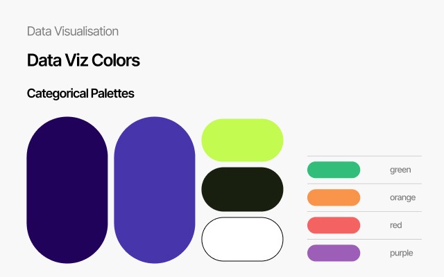
Colors- White base, with electric indigo as the primary accent. Lime green for highlights

Layout grid- Four columns with 20 pixel margins, built for mobile first across iOS and Android.
Components
Familiar by structure, distinctive in detail. Cards are clean and simple, clear information hierarchy with no visual noise. Pricing is transparent from the start, no bait and switch. The navigation bar carries four icons only, nothing more. The signature detail across the product is the rounded arrow element, a soft directional motif that replaces the sharp angles you see everywhere else in travel apps. It shows up consistently enough to feel intentional without drawing attention to itself. The first screen is a discovery homepage built like Airbnb. Attractions, hotels, restaurants, parks, all surfaced and sortable from the start. Booking lives one tab away. Trips is where everything comes together after you book, flight updates, gate changes, check-in, boarding passes, baggage tracking, all in one place. The whole product works like a travel agent that never goes offline.
Components
Familiar by structure, distinctive in detail. Cards are clean and simple, clear information hierarchy with no visual noise. Pricing is transparent from the start, no bait and switch. The navigation bar carries four icons only, nothing more. The signature detail across the product is the rounded arrow element, a soft directional motif that replaces the sharp angles you see everywhere else in travel apps. It shows up consistently enough to feel intentional without drawing attention to itself. The first screen is a discovery homepage built like Airbnb. Attractions, hotels, restaurants, parks, all surfaced and sortable from the start. Booking lives one tab away. Trips is where everything comes together after you book, flight updates, gate changes, check-in, boarding passes, baggage tracking, all in one place. The whole product works like a travel agent that never goes offline.


Direct, Not Redirected
One Booking, Every Piece
Most travel apps hand you off mid experience. You search a flight, an attraction, or a hotel, then get pushed off to a third party to finish, re-entering details you already gave, losing your place, and losing any sense that someone's actually holding your booking. That gap is where trust breaks down, users described exactly this feeling in research, not knowing whether something actually went through. Ascension keeps the entire experience inside the product. Flights, hotels, and attractions are booked directly through the app, with pricing transparent from the start and no bait and switch, so the user never has to second guess what they're paying for. Each step gets its own visible confirmation, so the doubt that usually creeps in after checkout never gets the chance to. And because the app owns what it sells rather than linking out to it, if something goes wrong, the user is talking to the company actually responsible, not chasing a third party. The result is a booking flow that feels less like using a tool and more like handing the trip to someone who's actually got it, which is exactly what the research kept pointing to, "show me the confirmation and get out of my way."
Direct, Not Redirected
One Booking, Every Piece
Most travel apps hand you off mid experience. You search a flight, an attraction, or a hotel, then get pushed off to a third party to finish, re-entering details you already gave, losing your place, and losing any sense that someone's actually holding your booking. That gap is where trust breaks down, users described exactly this feeling in research, not knowing whether something actually went through. Ascension keeps the entire experience inside the product. Flights, hotels, and attractions are booked directly through the app, with pricing transparent from the start and no bait and switch, so the user never has to second guess what they're paying for. Each step gets its own visible confirmation, so the doubt that usually creeps in after checkout never gets the chance to. And because the app owns what it sells rather than linking out to it, if something goes wrong, the user is talking to the company actually responsible, not chasing a third party. The result is a booking flow that feels less like using a tool and more like handing the trip to someone who's actually got it, which is exactly what the research kept pointing to, "show me the confirmation and get out of my way."


Closing
The Moment It Clicked
his project changed how I think about what a designer actually does. Ascension was not just about building a travel app. It was about bringing a team together around a shared vision and making better decisions, faster, because of it.
Winning Moments
Alignment before design. Getting product, engineering, and stakeholders on the same page before touching a single screen meant fewer conflicts, faster decisions, and a team that moved together.
Consistency that stuck. Building shared components and a unified visual language gave the product a coherence it did not have before, and gave the team a foundation to build on going forward.
From screen maker to problem solver. Halfway through the project I realized the team was no longer asking me what color a button should be. They were asking how we should solve the problem. That shift said everything about where the real value of design lives.
Lessons Learned
Influence comes from the right questions. A polished mockup does not move people. Asking the right question, listening carefully, and helping different teams reach a shared understanding does.
The best solution fits the reality. Ambition is good but the solution that delivers the most value within the team's actual time, budget, and technical constraints is always the right call.
The best assets come from conversations. I became more intentional about involving engineers, product managers, and stakeholders throughout the process, not just at handoff. That is where the real work happens.
Closing
The Moment It Clicked
his project changed how I think about what a designer actually does. Ascension was not just about building a travel app. It was about bringing a team together around a shared vision and making better decisions, faster, because of it.
Winning Moments
Alignment before design. Getting product, engineering, and stakeholders on the same page before touching a single screen meant fewer conflicts, faster decisions, and a team that moved together.
Consistency that stuck. Building shared components and a unified visual language gave the product a coherence it did not have before, and gave the team a foundation to build on going forward.
From screen maker to problem solver. Halfway through the project I realized the team was no longer asking me what color a button should be. They were asking how we should solve the problem. That shift said everything about where the real value of design lives.
Lessons Learned
Influence comes from the right questions. A polished mockup does not move people. Asking the right question, listening carefully, and helping different teams reach a shared understanding does.
The best solution fits the reality. Ambition is good but the solution that delivers the most value within the team's actual time, budget, and technical constraints is always the right call.
The best assets come from conversations. I became more intentional about involving engineers, product managers, and stakeholders throughout the process, not just at handoff. That is where the real work happens.

@shahaf
contact@shahaf.com